
Page 40 - FLIPMAG.NET
P. 40
Storytelling Techniques
MIX IN EMOTION WITH LESZEK GLASNER
CLEVER USE OF COLOUR
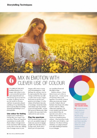
T’S ONE OF THE KEY images will create a warm on a gradient from red
building blocks of an and welcoming glow. Cold through to blue.
image, and colour is also feelings, by contrast, tend to Similar colours – those
a very powerful narrative be represented by blue tones. that sit near each other in
Iand compositional tool. Using a subtle blue can add the spectrum – create a sense
The human eye is so reactive a cooler tone to your images. of harmony when used
to colour. It affects how we Red tends to signify both together. Use similar colours
see the world in all ways, passion and danger. It is the when you want your image
and how we perceive almost colour of the heart, but also to settle. Colours that sit
anything. It can therefore be of warnings. Green has links further away from each other UNDERSTANDING
used to great effect in adding with nature and the notions tend to contrast. These, THE COLOUR WHEEL
meaning and feeling to your of growth and health… unless when used together, can n If we join the ends
photographs. that green is fluorescent, then create tension and intrigue, of the spectrum
it tends to be associated with particularly if they sit together we get
radioactivity and toxicity. opposite each other on the a colour wheel.
Use colour for feeling
Colours carry with them a colour wheel. These are Neighbouring
feeling they can impart into Play the spectrum known as complementary colours are known as
our shots. These are based on Mixing colours together can colours – they somehow make harmonious colours
associations we make with give you an endless range of each other seem brighter, and and those opposite
those colours. Orange tends tones you can use to engage stand out. Use these to bring each other on the
to be associated with warmth, people with the story you’re attention to a single element wheel are called
such as fire or the sun. Adding trying to tell. Each colour or to add a feeling of tension complementary
lots of orange tones to your forms part of a spectrum, to your images. colours.
40 PRACTICAL PHOTOGRAPHY